
SVCM Has a New Look! Here’s the Story Behind It
At Swannanoa Valley Christian Ministry, our primary focus has always been helping others. But about a year ago, we looked in the mirror and realized our ministry needed a bit of a makeover! As a nonprofit, we wanted our logo and branding to more clearly reflect who we are and what we do. SVCM is in a time of growth, expanding the capacity of our Crisis Ministry while adding two new programs: NeighborCare and Hammer & Heart. These programs needed branding that spoke to their distinct missions, but also to their unity under the umbrella of SVCM.
Since then, we’ve been on a creative journey. We’ve made this journey patiently, behind the scenes, amid all the daily demands of the ministry. It has required much thought, prayer, discussion, and at times even debate. We persevered, choosing to trust the process, trust each other, and trust that the Lord would guide us. The good fruit of this journey is a refreshed look for SVCM that we’re so excited to share with our community!
We hope many elements of our new branding will be easy for you to recognize and will speak to your heart right away. But if you’re curious to read more about what the new artwork means to us, please read on!
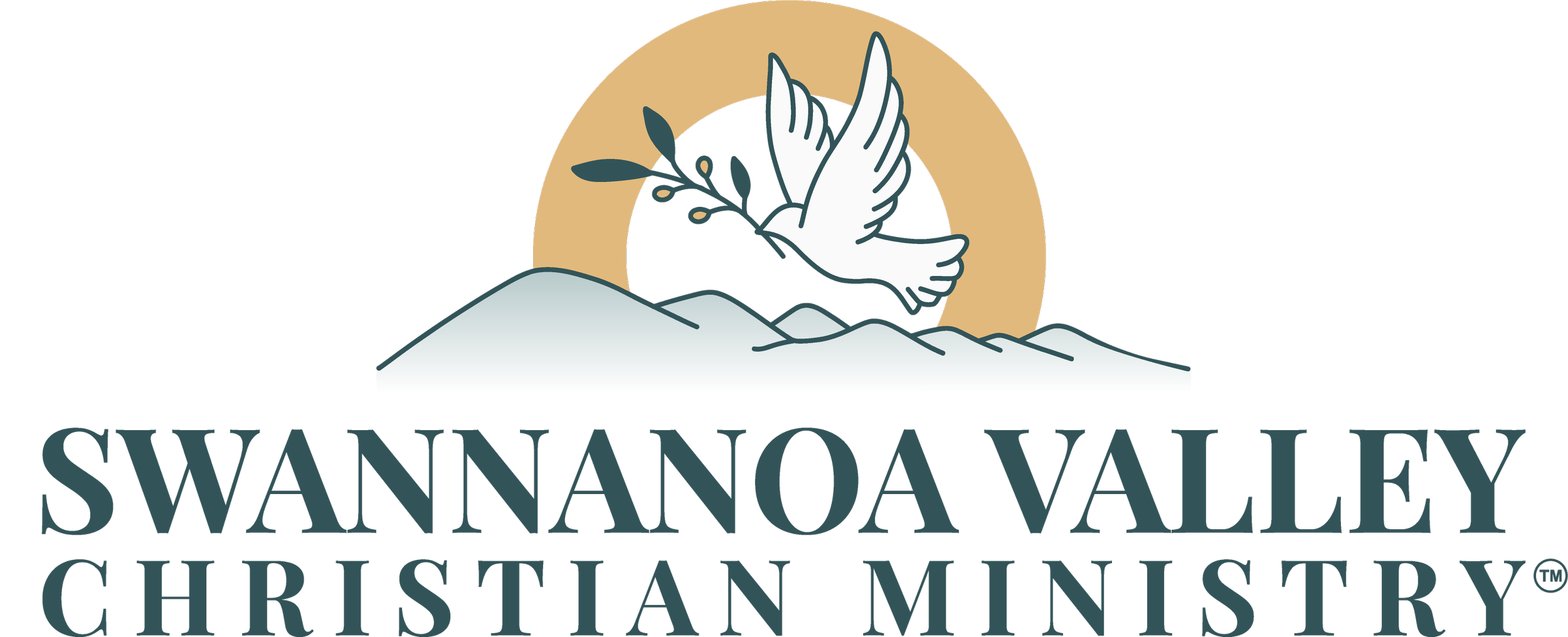
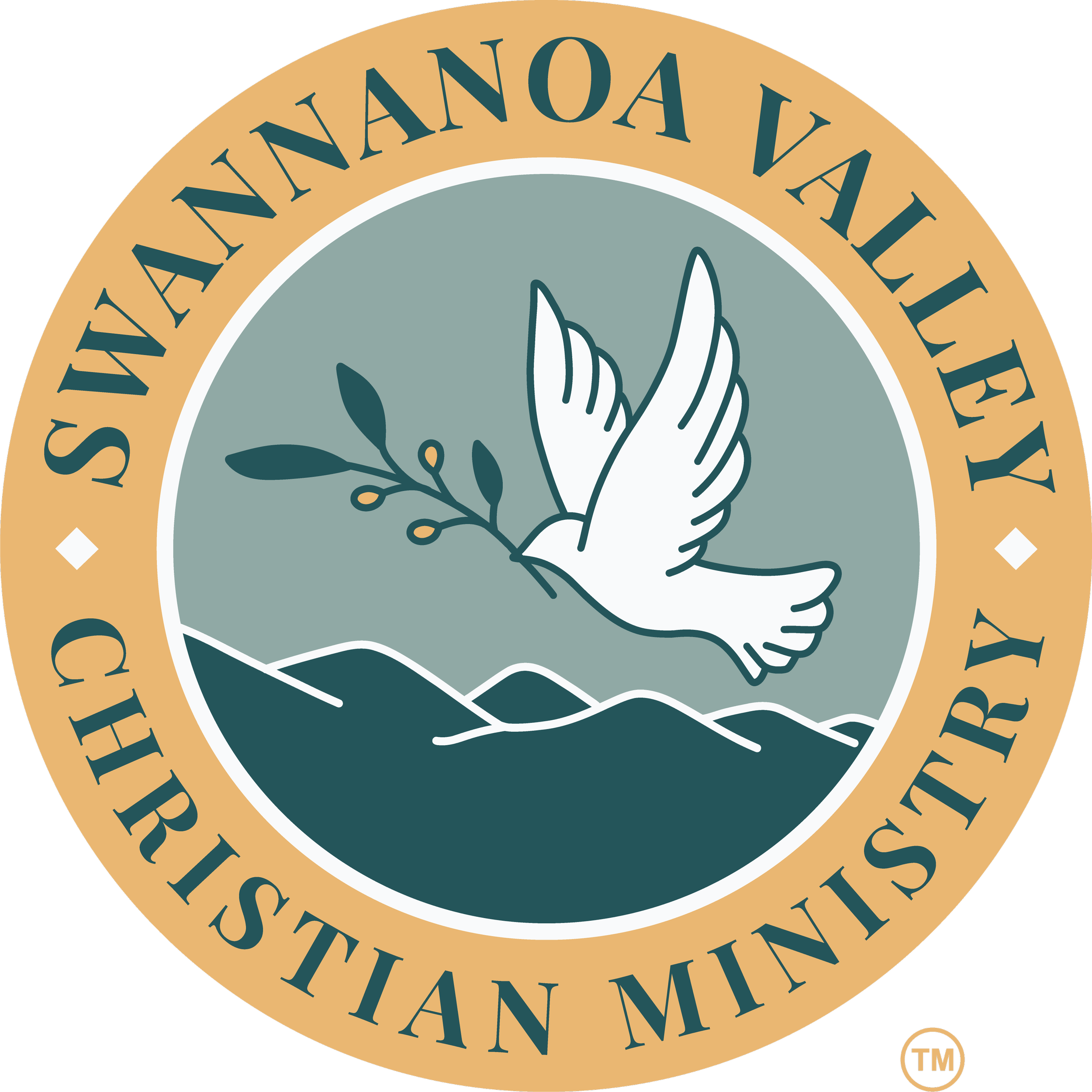
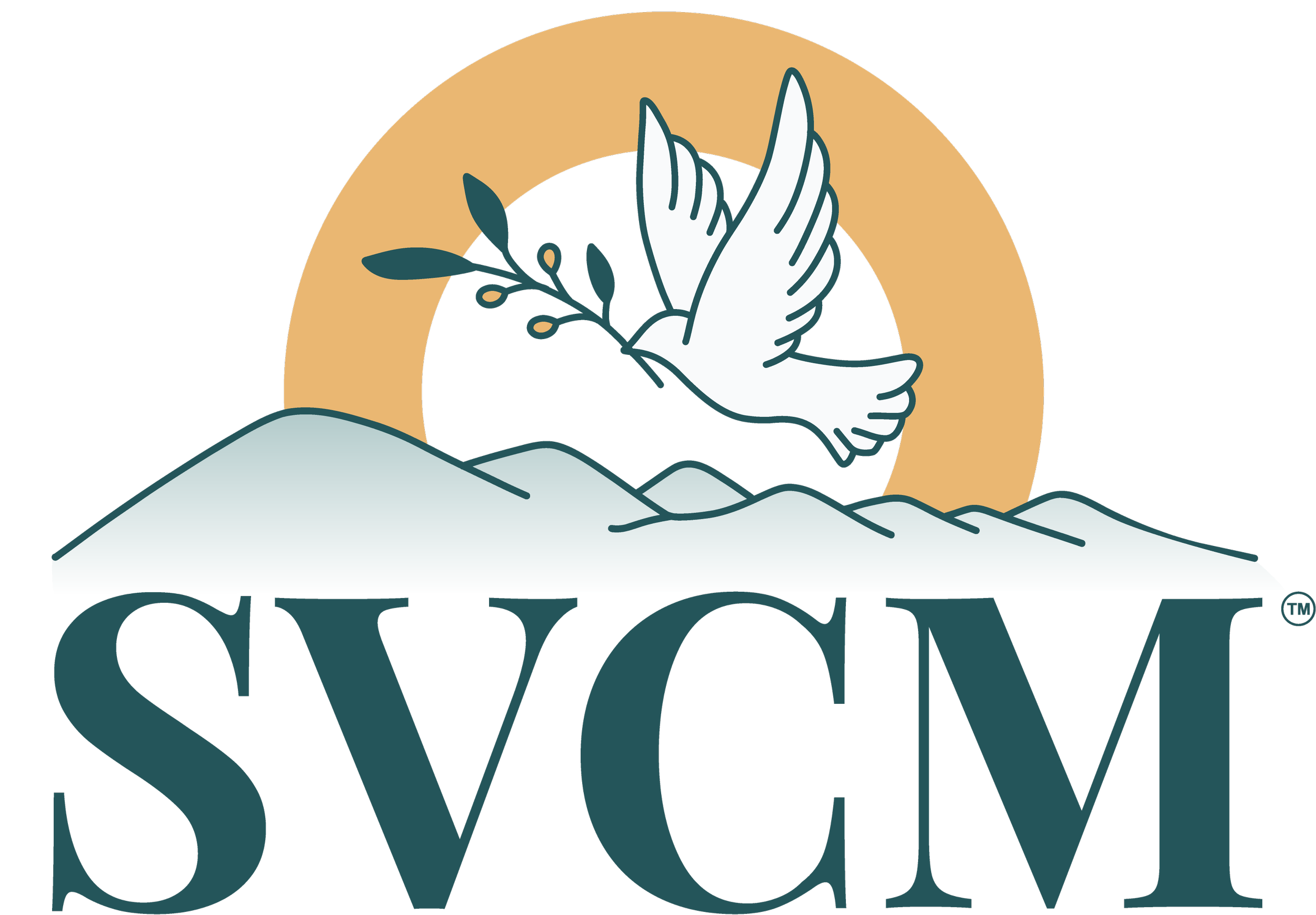
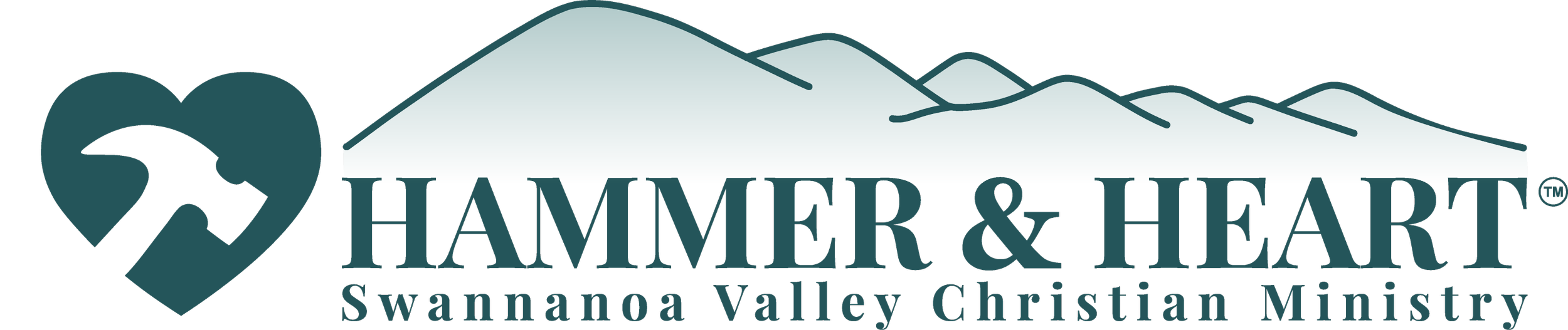
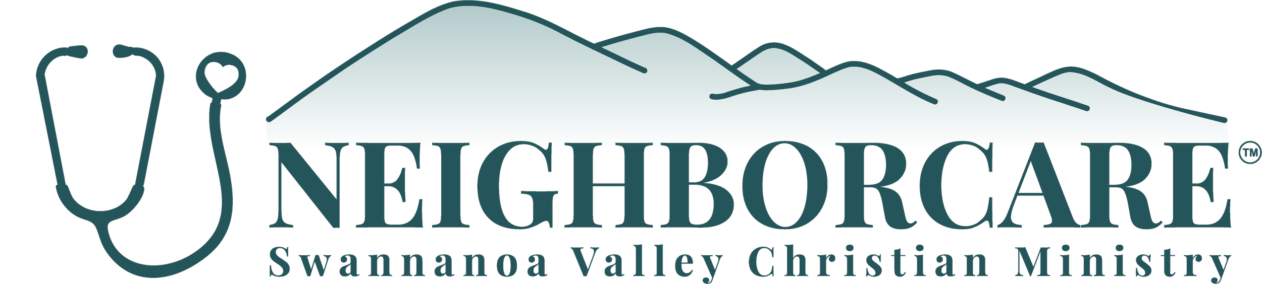
The Seven Sisters mountain range: Since SVCM’s founding in 1975, our mission has been to serve our neighbors in the Swannanoa Valley. This valley is our home. We hope our neighbors here will recognize the iconic Seven Sisters mountain range in our new logos. This beautiful mountain range is visible from many points in the valley and from our ministry. Including it in our logos grounds us in a strong sense of place.
The Seven Sisters also form the east side of the North Fork reservoir, Asheville’s main source of drinking water. Alone, these individual peaks could not hold much water, but together, they form a deep lake that sustains many. Like the peaks of the Seven Sisters, SVCM’s member churches are distinct. Yet working closely, we can offer a deeper, wider pool of resources for our neighbors in need. Standing together, we form a bulwark against poverty of all kinds in our valley.
A dove in flight, carrying an olive branch: We wanted our new logo to speak to SVCM’s spiritual identity as an ecumenical Christian ministry. We are not a church, but we were founded by a diverse group of eight Swannanoa Valley churches. Despite real denominational differences, these founding member churches envisioned coordinating their efforts to serve “the least of these” (Matthew 25:31-46). Working together, we also strive towards Christ’s fervent prayer “that they may be one” (John 17:20-23).
For Christians, the dove carrying an olive branch is a symbol rich with meaning. First, it recalls the book of Genesis, when after the great flood Noah repeatedly sends out a dove from the ark. “When the dove returned to him in the evening, there in its beak was a freshly plucked olive leaf! Then Noah knew that the water had receded from the earth.” (Genesis 8:11) As our valley continues to recover from Helene, the great flood of our time, the dove can once again serve as a hopeful symbol of new life.
Since apostolic times, Christians have seen Noah’s Ark as a prefigurement of the Church itself. (1 Peter 3:20-21). Like Noah sent the dove from the ark, SVCM’s member churches send our ministry forth to serve a hurting world.
The dove becomes associated with the Holy Spirit in the gospel accounts of Jesus’ baptism. (Matthew 3:16, Mark 1:10, Luke 3:22, John 1:32-33). Across denominations, the Holy Spirit unites Christians through baptism.
In its beak, SVCM’s dove carries an olive branch with three leaves and three olives. This can symbolize the Holy Trinity, another point of unity for Christians.
The dove carrying an olive branch has also become a universally recognized symbol of peace. St. Paul speaks of peace as one of the fruits of the Holy Spirit (Galatians 5:22-23). We hope the dove will communicate to people from diverse walks of life that SVCM is a peaceful place where they may seek assistance.
The yellow arch: This is primarily a visual element that helps tie the composition together, but it can also be seen as sunlight or sunrise. This too speaks to our spiritual identity, as Jesus is “the light of the world” and calls us to be the same (John 8:12, Matthew 5:14). We hope that the tangible aid and love our neighbors receive at SVCM feels like the dawning of a bright new day in their lives. “The light shines in the darkness, and the darkness has not overcome it.” John 1:5
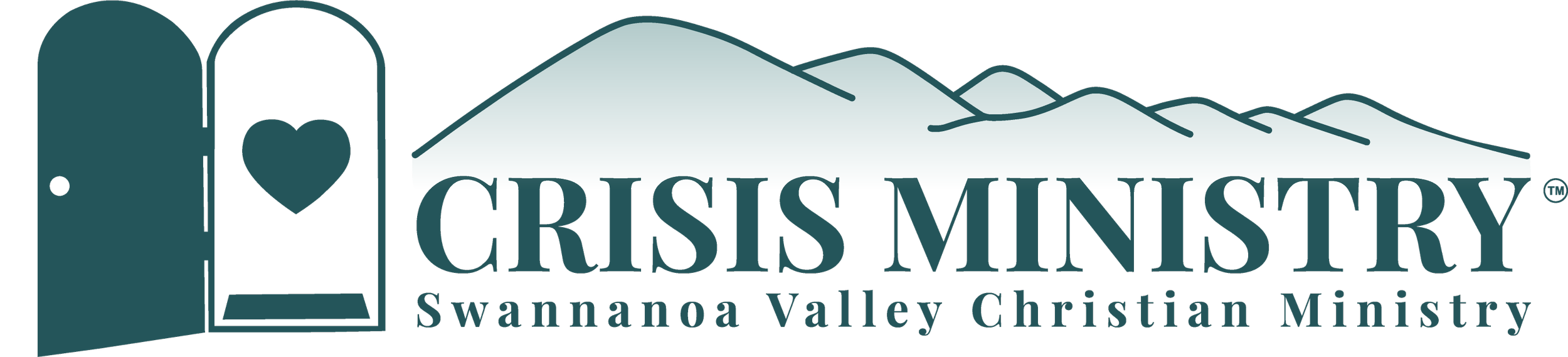
The program logo hearts: The original logos for all three SVCM programs included a heart. We decided to keep that! At SVCM, our mission goes beyond merely providing goods or services. We strive to embody Christ’s love in all we do. Each program logo speaks not only to what the program does, but the heart with which we do it. The heart is mentioned over 800 times in scripture. Jesus calls us not only to do good deeds outwardly, but to love from our hearts. (Matthew 22:37)
The Crisis Ministry Logo: Walking into the Crisis Ministry, you will notice signs that say: “All are to be welcomed as Christ.” Drawn from the Benedictine monastic tradition, this saying is rooted in Christ’s exhortation to welcome the stranger as you would like to welcome Him (Matthew 25:35). The open door with a welcome mat and a heart inside reflects our commitment to offer humble, warm hospitality to folks from all walks of life who come through our door in need. The door also speaks to the Crisis Ministry’s home in Black Mountain, where we’ve welcomed neighbors for almost 40 years.
The Hammer & Heart Logo: Established in 2021, Hammer & Heart’s logo has always featured a hammer inside a heart. Smart, straightforward and easy to recognize, this symbol clearly speaks to Hammer & Heart’s mission: reclaiming dignity through urgent home repairs.
The NeighborCare Logo: Founded in 2025 in the wake of Helene, NeighborCare’s original logo included a stethoscope, a heart shape, and mountains in the background. NeighborCare’s new logo carries these meaningful symbols forward, communicating the program’s mission to restore well-being through free and compassionate healthcare.
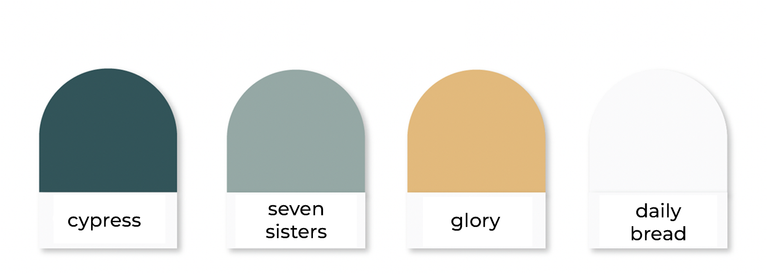


Color palette: The primary color is Cypress, a bold, saturated blue-green that nods to the green in SVCM’s and Hammer & Heart’s first logos, while evoking the color of the Swannanoa Valley’s mountains. On a white background, Cypress provides excellent contrast and readability. Cypress combined with Seven Sisters, Glory, and Daily Bread offer a color palette that is both eye-catching and approachable, communicating calm, warmth and welcome to people in crisis.
Fonts: Playfair Display, our logo and header font, reads as reliable, approachable, and classic. Our body font Montserrat is clean, understated and legible. Most importantly, these two fonts provide excellent clarity and readability across a variety of contexts, from small social media icons to large printed banners. Playfair Display and Montserrat harmonize well together and with the logo artwork.
SVCM would like to thank graphic designer Liia Mägi Suarez and Kaleidoscopic Creative for their work on this project!